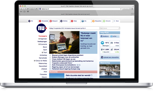
NU.nl is the largest news site in the Netherlands. The website attracts about 1.5 million visitors per day. Good for a reach of 40% of all Dutch people aged 13 years and older. And that’s a lot. Ibuildings has been involved with NU.nl for many years. In the rebuilding, several further developments and now in the redesign. Serge van Steensel, ICT Manager News at Sanoma Digital to which NU.nl belongs, talks about this final phase. But first we look back to 2008, when Ibuildings developed a new CMS for NU.nl..
More efficient management with new CMS
Joris van Lierop, then publisher of NU.nl: “NU.nl grew enormously. At the same time all kinds of sites were added, such as NUfoto, NUjij, NUzakelijk, NUsport and NUbijlage. In order to keep up with our growth, we decided to rebuild. We needed a new CMS, with which the editors could manage and edit messages easier and more efficient. Not only on NU.nl, but on all new sources. A CMS in which not the technique was paramount, but the user.”
Editing as user central
Ibuildings built a powerful, custom made CMS. The working method of the editors was central to this. Van Lierop: “Ibuildings studied intensively how our editors work. They also had regular meetings. This resulted in a CMS that gave the editors maximum freedom to publish news and link it easily to our extensive video and photo applications. We had the quality of the CMS tested by means of a code audit. The conclusion was that such reliable and secure software can only be taken for granted in the banking sector. So that was a good thing…”
Wider layout for more applications
In the meantime, IT developments continued. The original design of NU.nl was quite narrow, matching the smaller screens of a few years ago. With the advent of new screen widths, the need arose for a wider, more modern layout. ICT Manager Serge van Steensel: “A wider layout had to increase usability and gave room for more advertising positions, our main source of income. We also wanted an integrated menu bar for more direct traffic to the subsites, such as NUsport and NUzakelijk. And a better position for social media in the layout. Our starting point was that only the design was changed. Technology, infrastructure and functionality remained unchanged”.
Comprehensive and labor-intensive
It seemed like a fairly simple redesign project: a broader layout. But it soon became clear that there were considerable consequences. Van Steensel: “Some examples? A new layout meant that we had to convert all the images into new formats. Then we’re talking about 100,000 and images. We had to convert existing content blocks to new dimensions. All advertising formats changed, which had a major impact on the traffic and sales departments. In short, what seemed like a simple project turned out to be very extensive and labour-intensive. We automated as much as possible, but we also needed a lot of manpower”.
The project required a lot of flexibility from everyone. Van Steensel: “Ibuildings responded well to that. We had a lot of personal consultation, which was also necessary. Fortunately, as a builder Ibuildings knew the NU.nl website through and through, so we were always on one wavelength. They are a pleasant party to work with. Besides their technical expertise, they have a clear vision on how to deal with projects.
The people who work there are down-to-earth, transparent and critical. You actually work as partners. In addition, Ibuildings has of course proven in previous projects to deliver on time, within budget and according to the agreed requirements”.
Clear results
The redesign has already yielded considerable results for NU.nl. “The wider layout has given us more advertising positions, so more revenue. We also see a higher traffic to the subsites. Thirdly, we have a lot more visitors from social media. In six months time, the number of visits with social media as a source has increased from 2% to 7%. People share news, but will also follow us on Facebook and Twitter.
In addition to our financial goals, one of our goals is that we want to be present on as many channels as possible. The new layout of the site is an excellent tool for this”, says Serge van Steensel.
